American Airlines Cargo
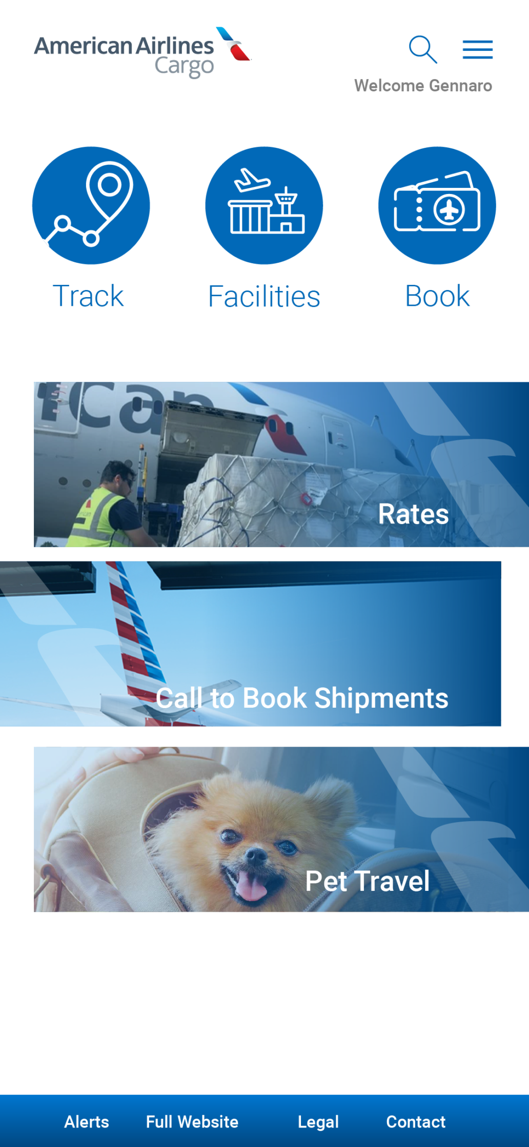
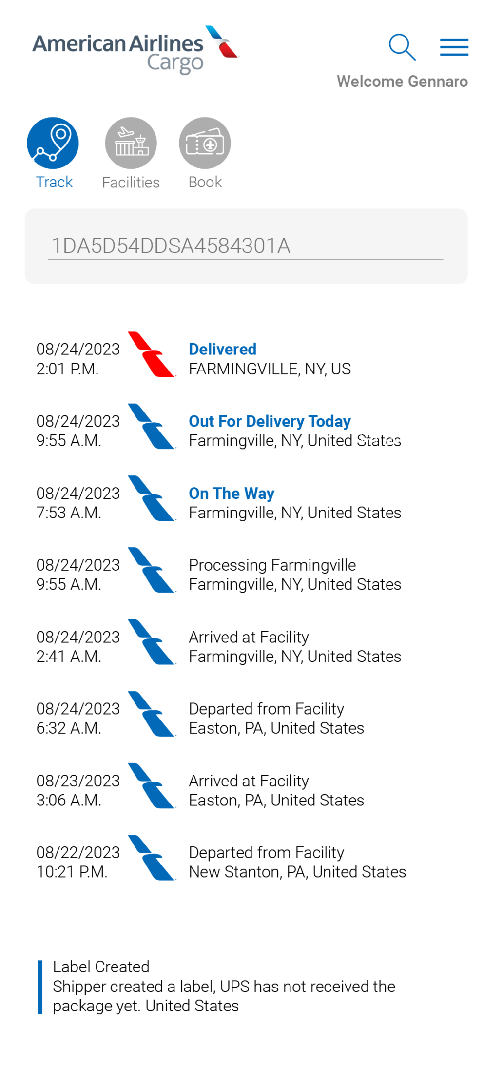
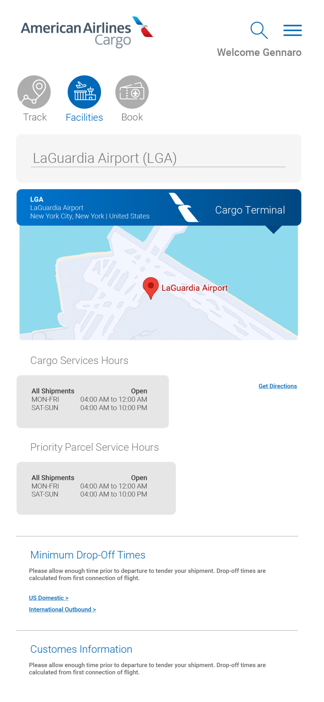
A cleaner, icon-led interface centered on the AA Cargo brand mark — giving customers fast access to shipment tracking, locations and rates.
What problem existed?
American Airlines Cargo needed a cleaner, more distinctly on-brand interface — one that made it fast for customers to do the three things they come to do most: track a shipment, find a location, and get a rate.
What I owned
I designed the UI/UX for the responsive customer experience.
How I got there
I centered the visual language around the AA Cargo logo, carrying it through the interface as a recurring anchor, and built a clear icon system so the three core actions — track, locate, get a rate — are immediately easy to find.
What shipped
A cleaner, icon-led responsive interface with the AA Cargo brand mark woven throughout, giving customers quick access to tracking, locations and rates.