Wall Street Journal Design System
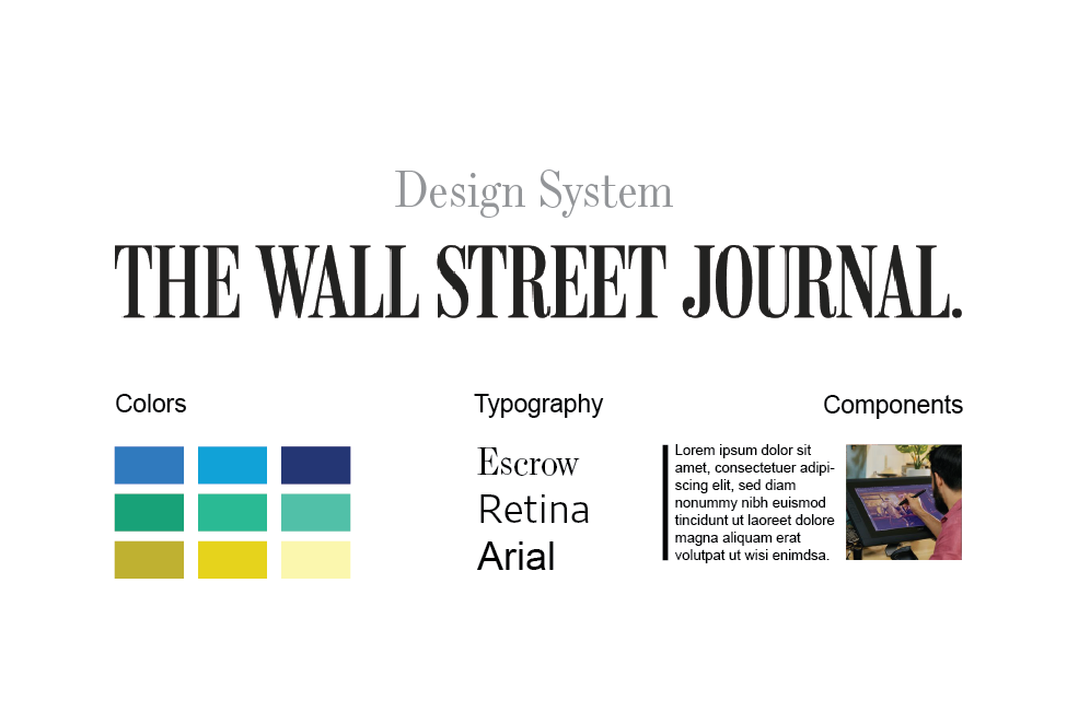
Creating a scalable design language across Dow Jones brands — The Wall Street Journal, MarketWatch and Barron's — so every team could reuse the same components, typography and color system.
What problem existed?
Dow Jones has multiple brands — The Wall Street Journal, MarketWatch and Barron's — that had each approached design and development separately. The result was inconsistent UI across the portfolio and duplicated effort on nearly identical patterns.
What I owned
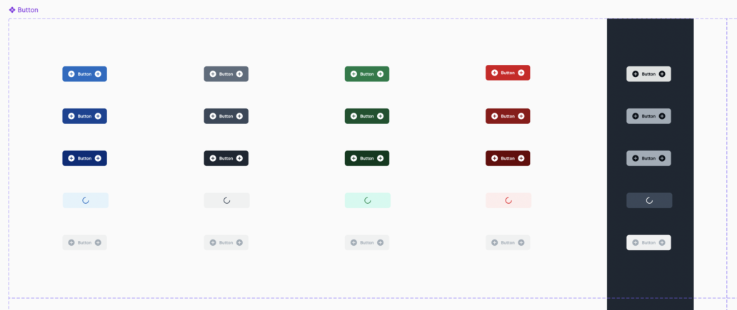
I led the design system effort: defining a shared component language — reusable components, a color theme, buttons, cards and typography — that multiple teams could adopt and, in theory, re-skin for their own brand.
How I got there
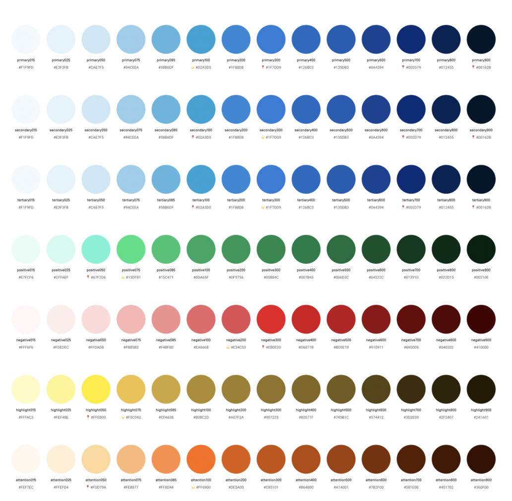
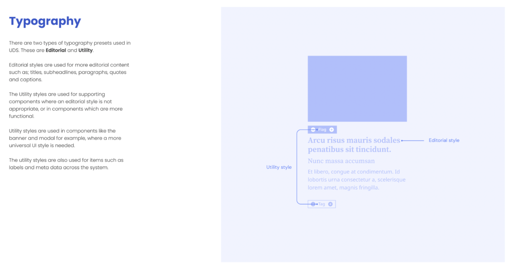
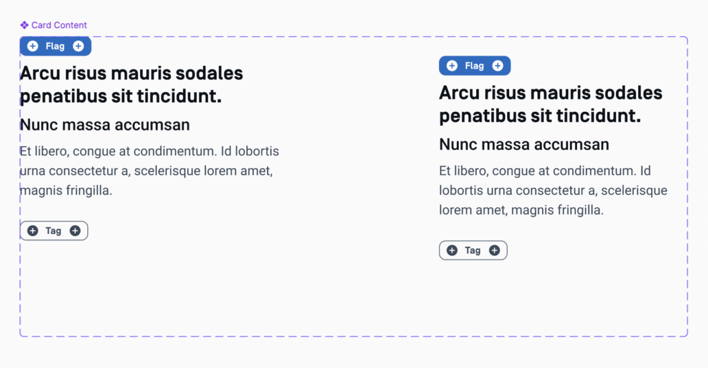
I built out a documented component set covering the core UI vocabulary — color palettes, typography for editorial and email contexts, ink colors, buttons, checkboxes and cards — along with specialized components for market data, since real-time financial data is central to how these brands work.
What shipped
A documented design system spanning color, typography, iconography and reusable UI components, built so each brand could keep its own editorial identity on top of a shared foundation.
What changed
The system gave three separate product teams a shared starting point instead of three separate ones — reducing duplicated design and engineering work across the Dow Jones portfolio.